
Two thousand and twenty-eighth of March
| Blog | Grigory Melkonyants |
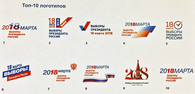
On Nov. 29, the Russian Central Elections Commission presented the logo for the presidential elections of 2018.
Social media was filled with comments, criticism of the design, its cost — 37 million rubles ($630,000) — and accusations of plagiarism, with some pointing out a similar image on Shutterstock and so on.
We often talk about the problems of elections — or rather not problems, but the crimes committed during the elections, the use of administrative resources, and lack of competition. So what the election logo looks like would seem to be a petty issue and just a matter of taste.
But the issue calls to mind one of those eternal questions: Does perception determine reality, or does reality determine perception? Out of hundreds of logos, for some reason the one chosen was one which has absolutely no visual association with elections.
At the Central Elections Commission meeting, Vartan Sarkisov, the general director of IMA-Consulting — the company that won the tender to provide informational support for the elections — said that more than 100 versions of the logo had been tested on more than 1,000 people in 12 cities.
Pre-testing showed that voters weren’t looking for something original and considered the winning logo state-like, fundamental, and conservative without being archaic.
In my opinion, when you compare this logo to its predecessor in the 2012 elections, it’s a step backwards.

The conclusion that “voters aren’t looking for something original” was most likely made by Sarkisov because other versions of the logo didn’t appeal to the participants. But why?
Are voters really so conservative, or were the other logos simply not worthy of their votes? Or have the Russian elections turned into something so abstract and devoid of content that they can only be expressed with a wavy ClipArt banner?
The members of the Central Elections Commission were only shown the ten versions that got the most votes in pre-testing, of which they ended up voting for a faceless and useless logo for the country’s main elections.
The same thing is happening with the candidates. If you look at the list, there might be 100 candidates, which is a sign of competition. But if among them there is no one who is truly competitive, who is interesting and original, then the winning candidates will be the ones who match this faceless logo. It isn’t quantity, but quality that matters to voters.
Apple founder, Steve Jobs, was right when he said, “people don't know what they want until you show it to them.” The job of the Elections Commission is to create conditions so that voters have an opportunity to learn about and support candidates from the entire political spectrum.
Otherwise before every election we’ll get “March2018,” confusing voters about the date of the election, which in this logo can be read two ways. Is it the 18th or is it 20th?
![]() Приложение для наблюдателей
Приложение для наблюдателей


* Справочник наблюдателя * Образцы жалоб * Законы. Нормативные акты и хроника их изменения * Тесты * СМС-ЦИК


Подпишитесь на телеграм-каналы


